


Q: Can you judge a lit mag by its cover?
"How much can a writer know about a lit mag, based on its cover?"

Welcome to our weekend conversation!
Last week, I interviewed Angela Yuriko Smith, Editor of Space and Time Magazine. She mentioned that early issues of the journal’s cover had been drawn by Gene Simmons. Yes, that Gene Simmons, of KISS glam rock super-stardom.

Who woulda thought a guy like this ever had any involvement with literary magazines? In the late 60s, he evidently did.
After our conversation, I found myself going into the rabbit hole of lit mag cover art. What fun!
Harvard Review has loosened up quite a bit since its simple font and solid colors of the early 90s.

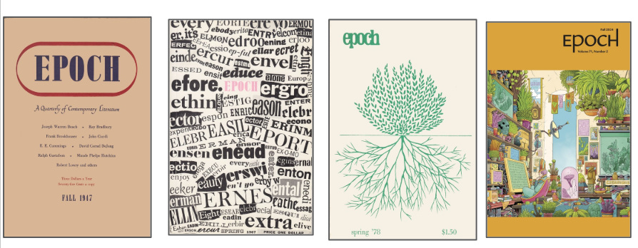
Epoch covers seem to be a window into every aesthetic phase of the decades—muted earth tones of the 40s, helter-skelter DIY collage-look of the 60s, back to nature in the 70s, then bright synthetic colors and lots of clutter in 2024.
Many older lit mags didn’t have visual art on their covers until the 1950s or so. (North Dakota Quarterly has come a long way from black and white text to…Porta Potties!)

Some magazines have changed not only the images but the style of the magazine’s name. The Yale Review has created new lettering in unexpected placements, suggesting greater openness to variety and experimentation over time.

Clearly, many editors put a lot of work into the covers of their journals. A lit mag cover often reflects a cultural mood, a political climate.
Here is Black Warrior Review in 2020, a picture that speaks volumes about what was happening in our world at the time.

Meanwhile, some lit mags avoid directly confronting a political moment altogether. Or else the visuals are more abstract. Here is New Letters from that same year:
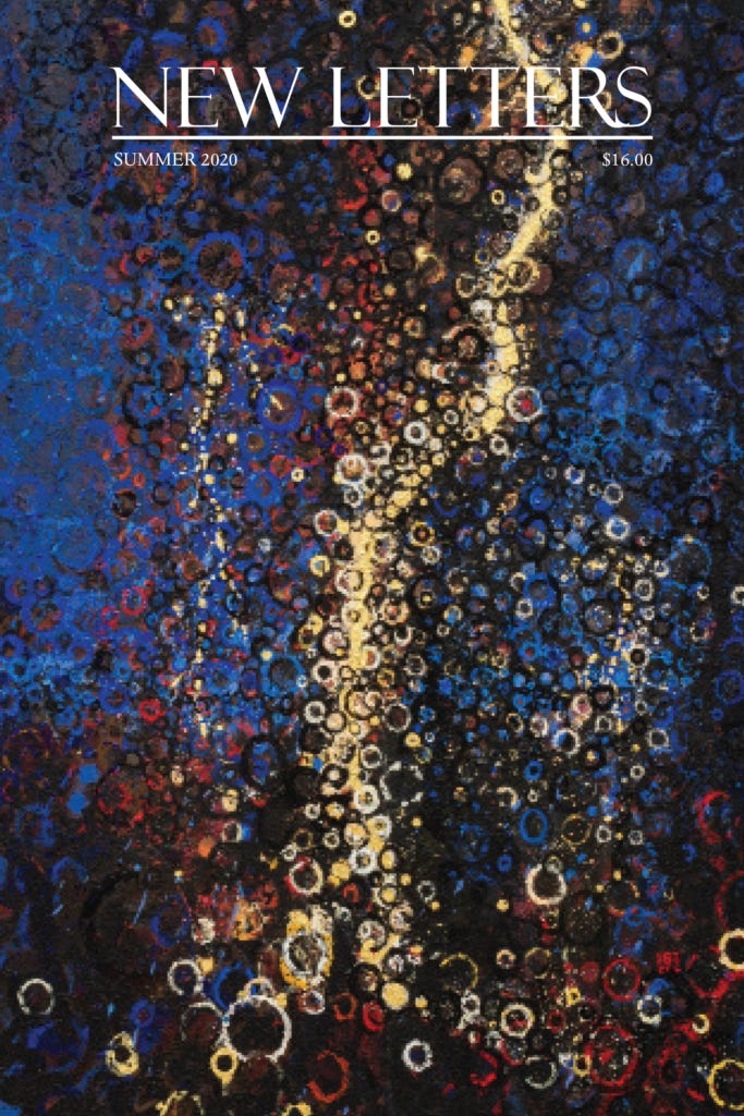
Let’s keep in mind, of course, that many lit mags are planned months or sometimes years before their release. A lit mag’s cover art might not reflect current events for simple practical reasons—current events change faster than the pace of lit mag development.
Nonetheless, can lit mag cover art be a guide toward what type of literature the editors aim to publish?
Looking at back issues of literary magazines to get a feel for what they like aesthetically could be a useful exercise. A journal that confronts political issues in its cover is possibly looking for writing that does so as well.
Similarly, provocative images might be a statement about the kind of provocative work editors are seeking.
Here is Paris Lit Up, No. 8. Many of you will have a strong reaction to this image. I would contend that it is impossible not to have a strong reaction to this image.
What might this cover tell us about the sort of work this journal seeks to publish?

Here is a recent issue of Broken Antler, another cover image that suggests a preference for certain kind of work. Indeed, in their guidelines the editors state they are “partial to a wide range of subgenres—body, cosmic, folk, gore, etc. (and our EIC likes any writing that screws with her sleep schedule).”

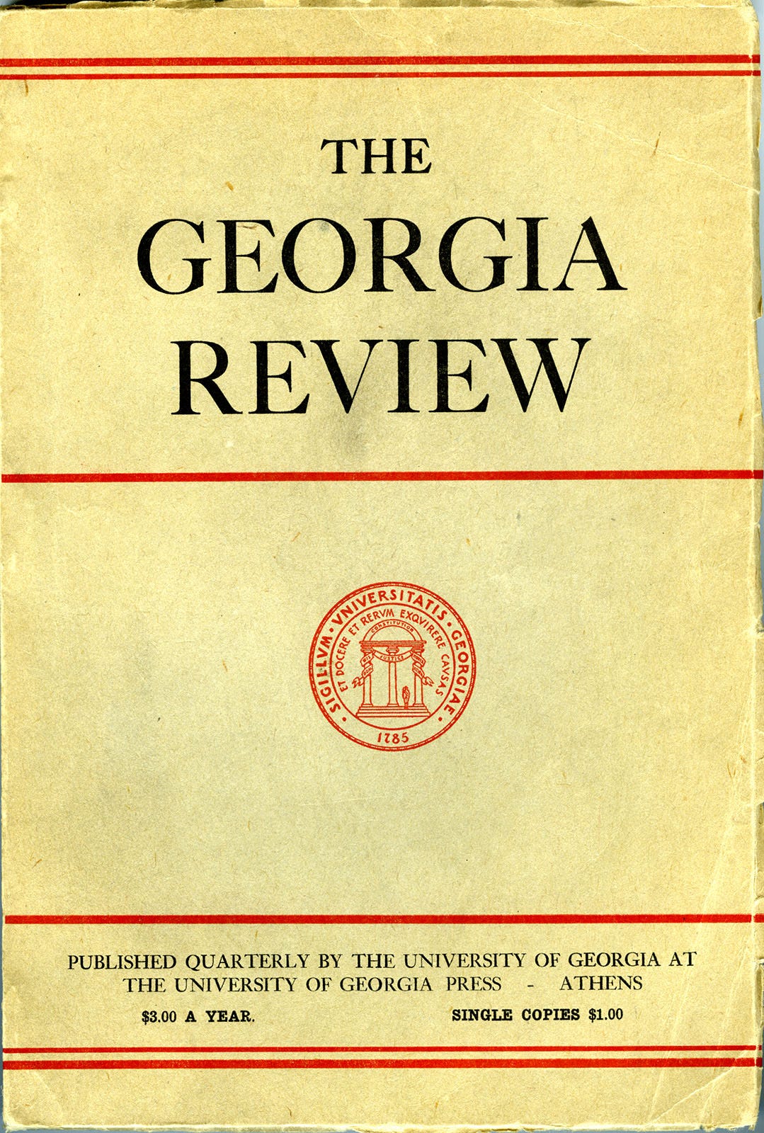
Here is one more cover that possibly provokes a visceral reaction in the viewer. This is a recent issue of The Georgia Review.
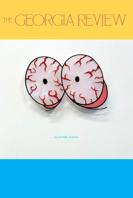
This lit mag has certainly come a long way from its birth in 1947.
One lit mag whose cover consistently and clearly represents its contents is The Sun. This magazine’s cover is always a black and white photograph and usually features people or animals. The covers evoke mystery and contemplation, suggesting an interest in writing about personal experiences. The magazine is a space for thoughtfulness and solace, these covers seem to say.

What about a magazine that has a variation of cover styles, from one issue to the next?
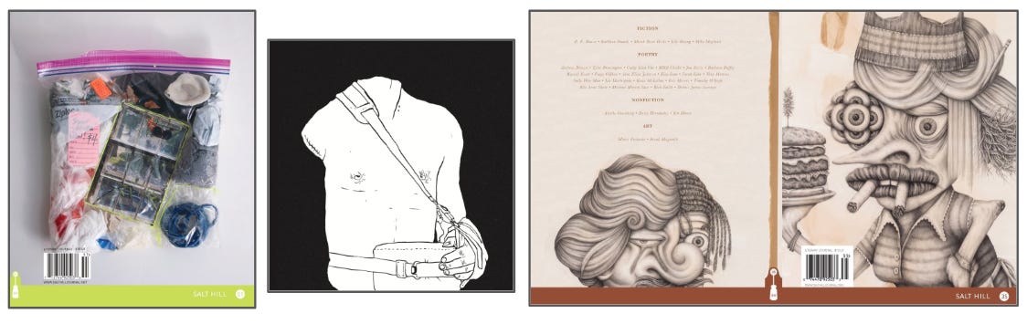
Here are several recent issues of Salt Hill. There is what looks like a photograph of something you’d see in a contemporary art gallery to a whimsical yet dark black-and-white sketch to a kind of surrealism that evokes, perhaps, cartoonist R. Crumb on LSD.
Could these covers, varied as they are, be clues to what this magazine publishes? Or does not publish?
A lot of lit mags appear to favor a kind of whimsical cover. Though on further inspection, the imagery contains darkness and surprise.
Here is a recent issue of Wild Roof. Notice the simple, playful black line, the sweetly misshapen claws of the bathtub. And yet—oh dear, some kind of electronic appliance is inside. Perhaps a toaster?

Here is Booth’s 20th issue. Notice the complementary colors, the cartoon-like graphics. And, of course, more whimsy with a splash of…Haha, um…what?

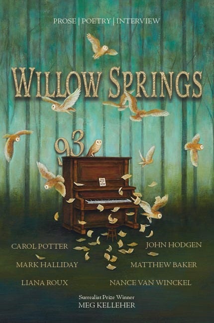
A recent issue of Willow Springs also invokes a whimsical feel, but in a spookier way. There is the forest beyond, the green fading into darkness. There is something of the strange fairytale happening here.
A vast majority of lit mags feature paintings or abstract art in their covers. For these it might be hard to deduce what type of work they seek, from image alone.

Some editors might not have the bandwidth or budget to put a lot of work into the cover art.
For some it might be a priority as high as the writing within the journal. When I interviewed the editors of The Florida Review, they mentioned the cover design was a huge part of revamping the journal’s vibe overall. The more recent covers arguably reflect a new openness to playful and humorous writing.

There are, of course, many more lit mag covers to highlight. Some are stunning and meant to stop you in your tracks. Some might fade into the background, indicating that the visual art, for whatever reason, is not the number one priority at the journal.
Some might be surrealist, indicating a clear preference for writing that leans into the speculative and strange. Others might be more conservative, suggesting a desire for work that’s more conventional.
As with any lit mag submitting process, there is no right or wrong way for a lit mag to design its cover. The question is, which lit mag cover speaks to you? Which cover feels like a match for the kind of work you write?
That is, assuming the contents of a lit mag can be determined by their covers at all. Which is the question of our weekend.
Can they? Can lit mags be judged by their covers?
Let’s discuss.
Is a lit mag’s cover a guide to the kind of work the editors like to publish? Does the cover reveal editorial tastes?
When you are deciding on where to publish your work, how much do you pay attention to the journal’s cover? Or have you not given it much thought at all?
Obviously, now that most lit mags are published online, they don’t have covers per se. Is website design a factor of consideration for you?
As editors, how do you think about the cover art? How do you try to capture the aesthetic of your magazine in the cover? Or, like the work you publish within, do you just go with what you love?
By the way, aren’t these lit mag archives so fun?

I wish we could share images in the comments. Unfortunately that’s not possible. But if you want to link to a lit mag cover that you love, that you designed and are proud of, or one which you have serious questions about, please do!
My Dad was one of the original editors of Epoch, so I have a lot of copies from over the years. Looking at the 1980s covers- several are abstract, a couple black and white nature covers, and a collage type artwork. After that it seems most covers are various artworks presented in the same format/layout as the 2024 example. Single copy prices rose from $1.00 in 1963 to 7 to 10 dollars for recent copies PDF online. They stopped printing the price on the cover recently. I don't know what any of that means, but it's still very hard to get accepted in Epoch!
Speculative lit mag (sci-fi/fantasy/horror/other genres) have really interesting covers. They tend to get left out of conversations. Really, it's worth spending some time checking out the artwork selections and how they shape reader expectations.
I'm sure someone out there can speak to the way covers were a key part of selling pulp novels and such back in the day.